 / Blog / / Blog /
Use elements of your brand like color, shape, weight, and style, but resist the urge to just use your logo. Remember that on your customers’ Home screens, your brand name is already underneath the app icon.
The role of a logo is to identify.
The role of an icon is to describe.
An app icon needs to balance these two things. Its job is not to “stand out” on the App Store. A user sees your app in the App Store only once, when they browse or search for it. But after they download it, they’ll see it on their Home screen thousands of times. Optimize for the latter.
Here are examples of logo icons and what they’d look like if they combined their brand identity with a descriptive icon.
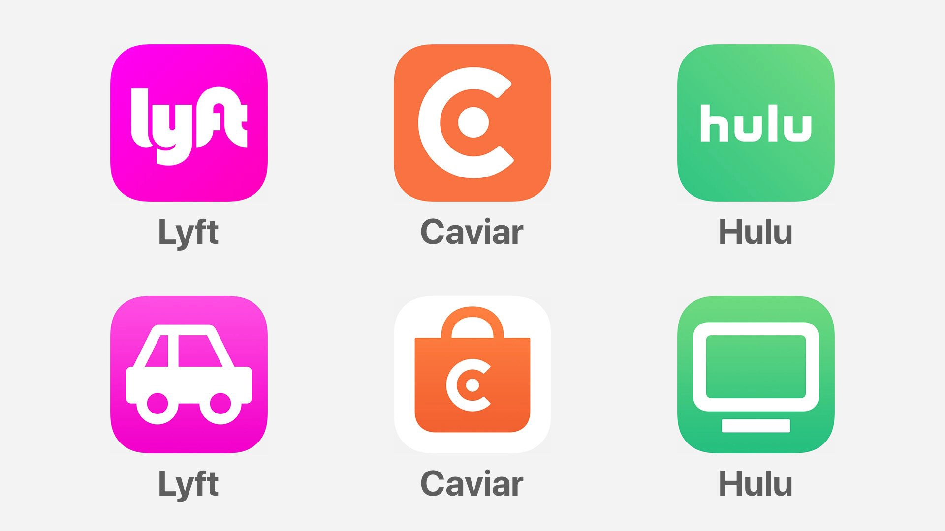
The Lyft car is blocky and round, like the Lyft wordmark. Actually, Lyft already uses this car symbol inside their app. A car icon from Uber or another ride-sharing service might look very different: black, silver, sleek, and luxurious.
The orange Caviar bag loses nothing if it can retain a simple logo, but gains so much in meaning.
Notice that the TV icon for Hulu harmonizes with the weight, shape, and style of the wordmark. It’s not just a TV symbol, it’s a Hulu TV symbol. The app icon’s color, symbol, and name beneath the icon work together.
A TV app icon for another app might look different! I’m not necessarily suggesting that every app in every category use the same exact metaphor, but for the sake of argument, here’s an example of how different brands might approach the same metaphor.
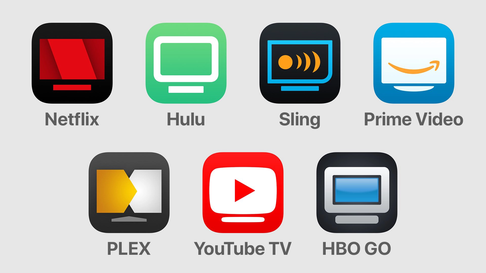
The point is that you don’t have to throw out brand equity to have an informative icon. You can have both.
And hey, don't just take my word for it. (We might disagree on what constitutes “essential,” but—)
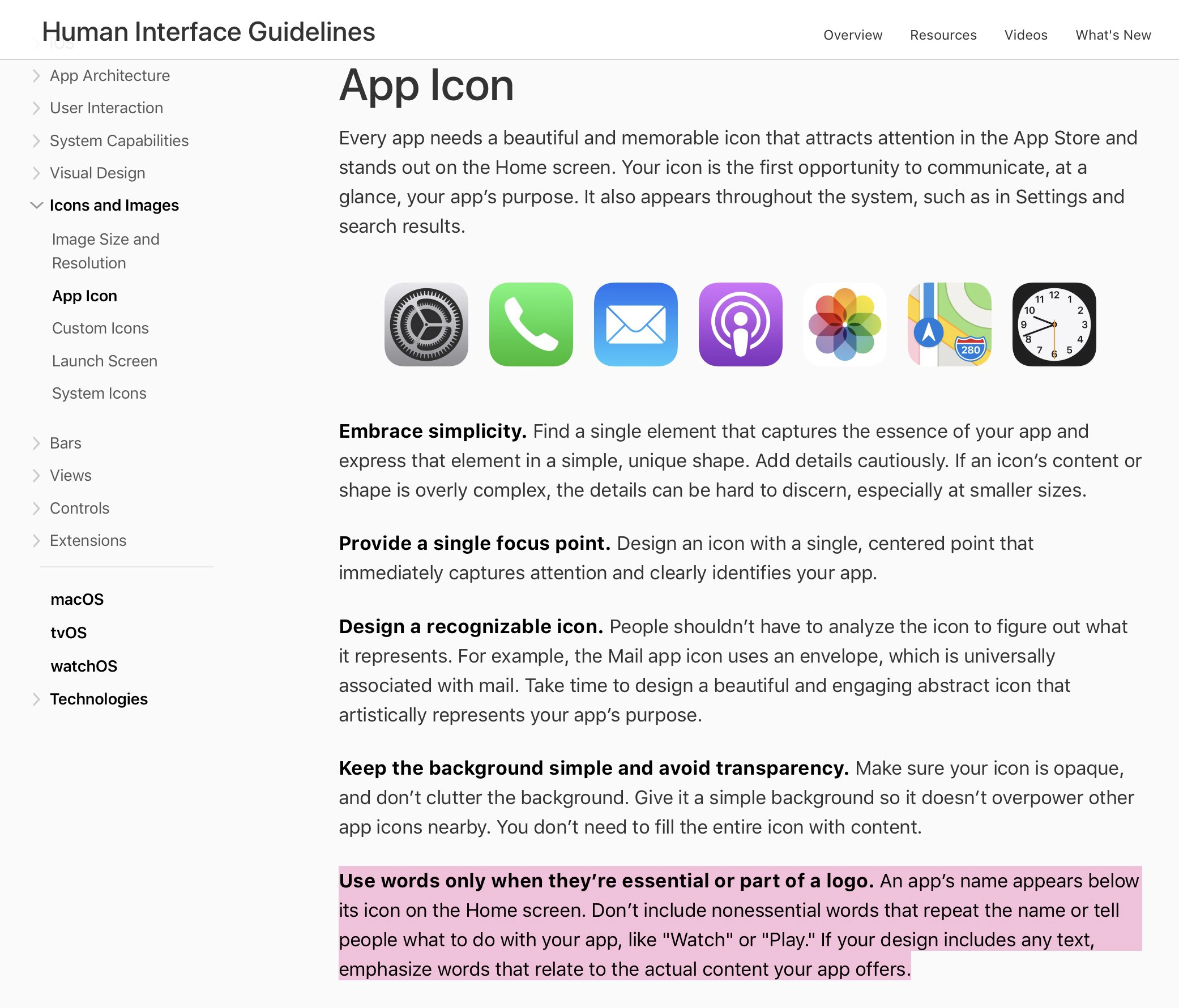
An app’s name appears below its icon on the Home screen. Don’t include nonessential words that repeat the name”
People shouldn’t have to analyze the icon to figure out what it represents. For example, the Mail app icon uses an envelope, which is universally associated with mail. Take time to design a beautiful and engaging abstract icon that artistically represents your app’s purpose.
Can logos be icons? Sure. Twitter and Airbnb are great examples of this. Their app icons don’t use wordmarks, but their logo symbols, which were undoubtedly created with the shape and size of an app icon in mind. I think they are wonderful examples of app icons that aren’t descriptive, but also aren’t app icons with wordmarks.