Time for another entry in the Louie-redesigns-a-logo series. Like other entries, this is just for fun and to think visually.
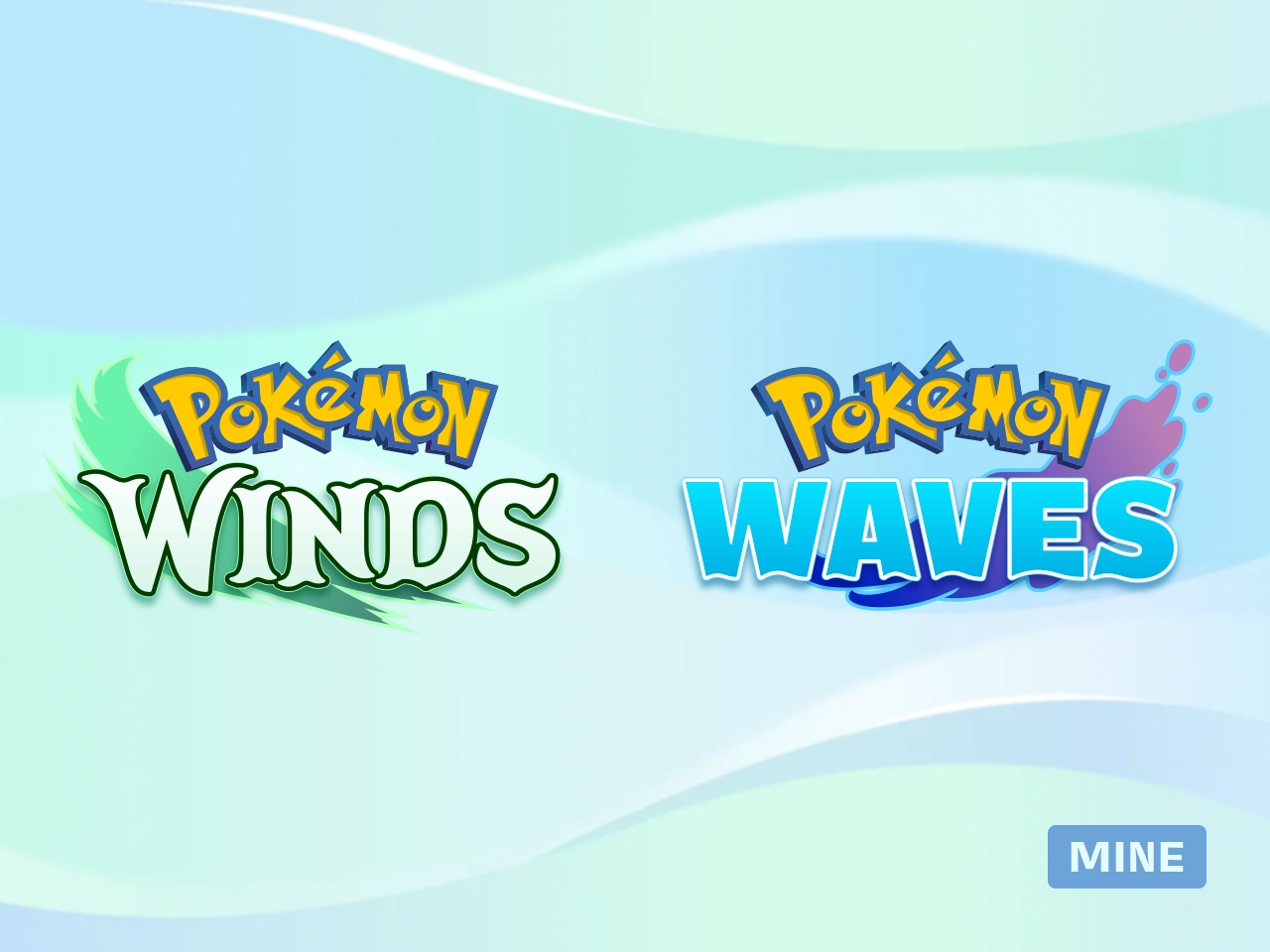
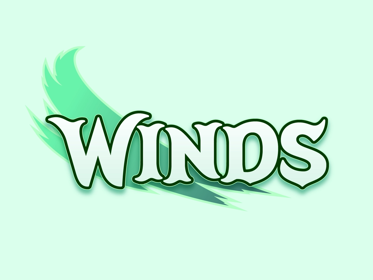
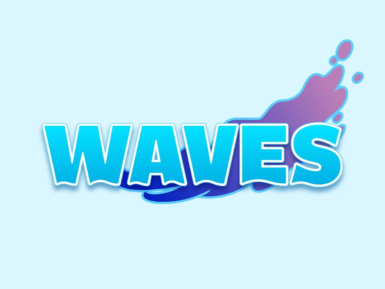
First, look at these close-ups, then read the analysis with comparisons below.
The actual English-language logos for these games are very disappointing to me. The letters in Winds appear to have a whimsical serif motif, but the W is unlike the others, and the S has what appears to be a serif that belongs on the top or bottom terminating at an angle instead. In Waves, it starts off alright, but gets pretty ugly by the time you get to the E and S. They are uncomfortably geometric, and the weight distribution is odd compared to the first letters.
On a hunch, I looked at the original logos in Japanese, which were much better by comparison. I immediately saw what happened. During the localization process, the intention of these styles was misunderstood.
When localizing logos, you have to understand how the strokes in the original writing system are drawn, so you can understand which motifs carry on in another writing system, or else, you end up applying them arbitrarily.
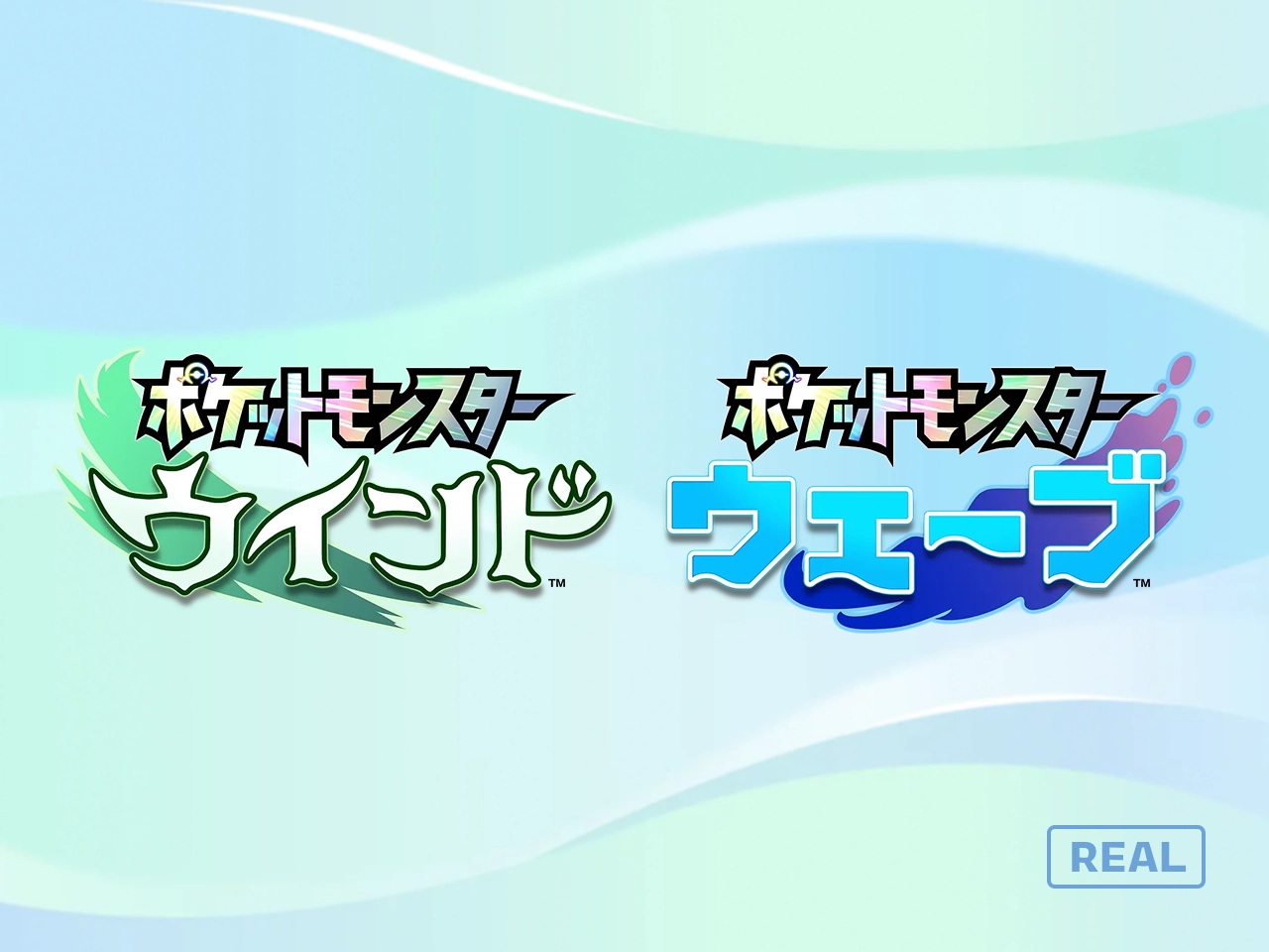
In the Japanese Winds logo, we can see how the diagonal stroke in イ could relate with a diagonal stroke in N. The characters with significant curved strokes like ウ and ン have a spur on the bottom, a characteristic completely omitted in the English logo. In Latin scripts, if an S has only one serif, it’s more likely to be found on the top rather than the bottom, so borrowing the top-left stroke motif in ウ for the top right of S works better than in the W, and ending the S with an upward taper looks more harmonious when comparing to curved letters in the Japanese logo.
In the Japanese Waves logo, there are only 45-degree-angle strokes. But it is also very bold and mono-weight. The weight distribution in the W would be better with a narrower second stroke. The E and S are improved with a subtle weight differences in the strokes as well. If the W, A, and V, letters instead share the same angle as each other, the rugged geometric motif can still carry on from the Japanese logo without the E and S bearing the brunt of it.
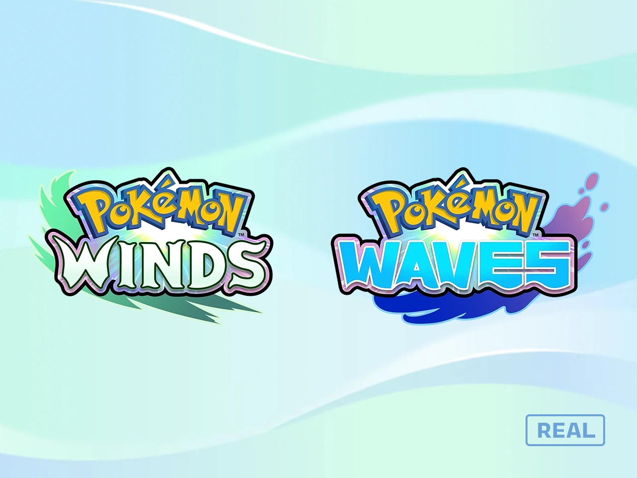
Now, compare my interpretations with the originals.
Also, two strokes is enough, don’t you think? The whole lockup being wrapped in another outline with a starburst background is a bit much.
